Comic Con
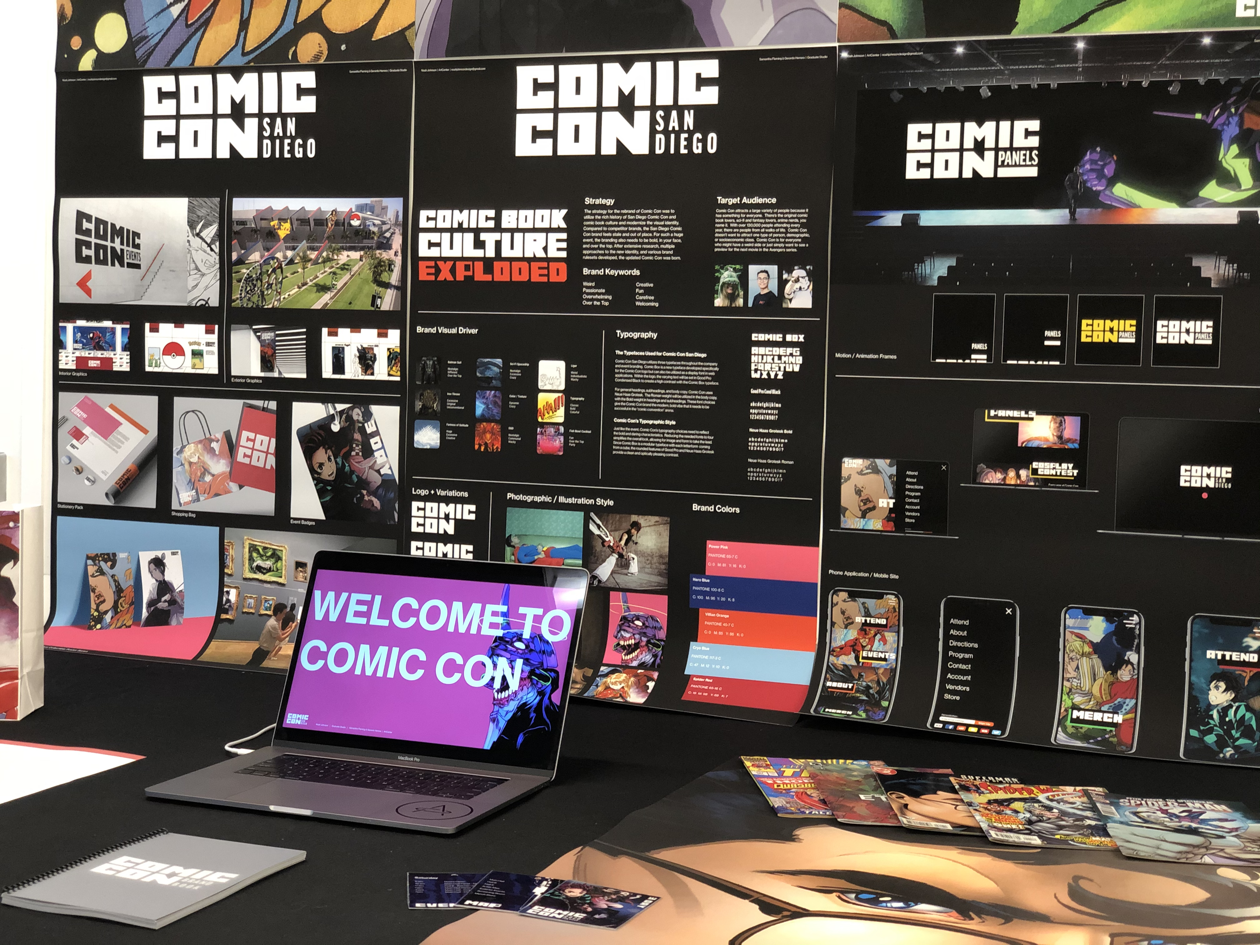
The project goal: Develop a complete rebrand for a company that is struggling with a strong visual identity. Comic Con’s existing visual identity has not been updated in years, inconsistent across platforms, and does not match the vibe of the event.
The design goal: Research all components of Comic Con San Diego and the Comic Con brand, redo the current visual identity, and establish a strong, new voice for the company.
Deliverables:
Brand Update
Typeface Design
Logo Design
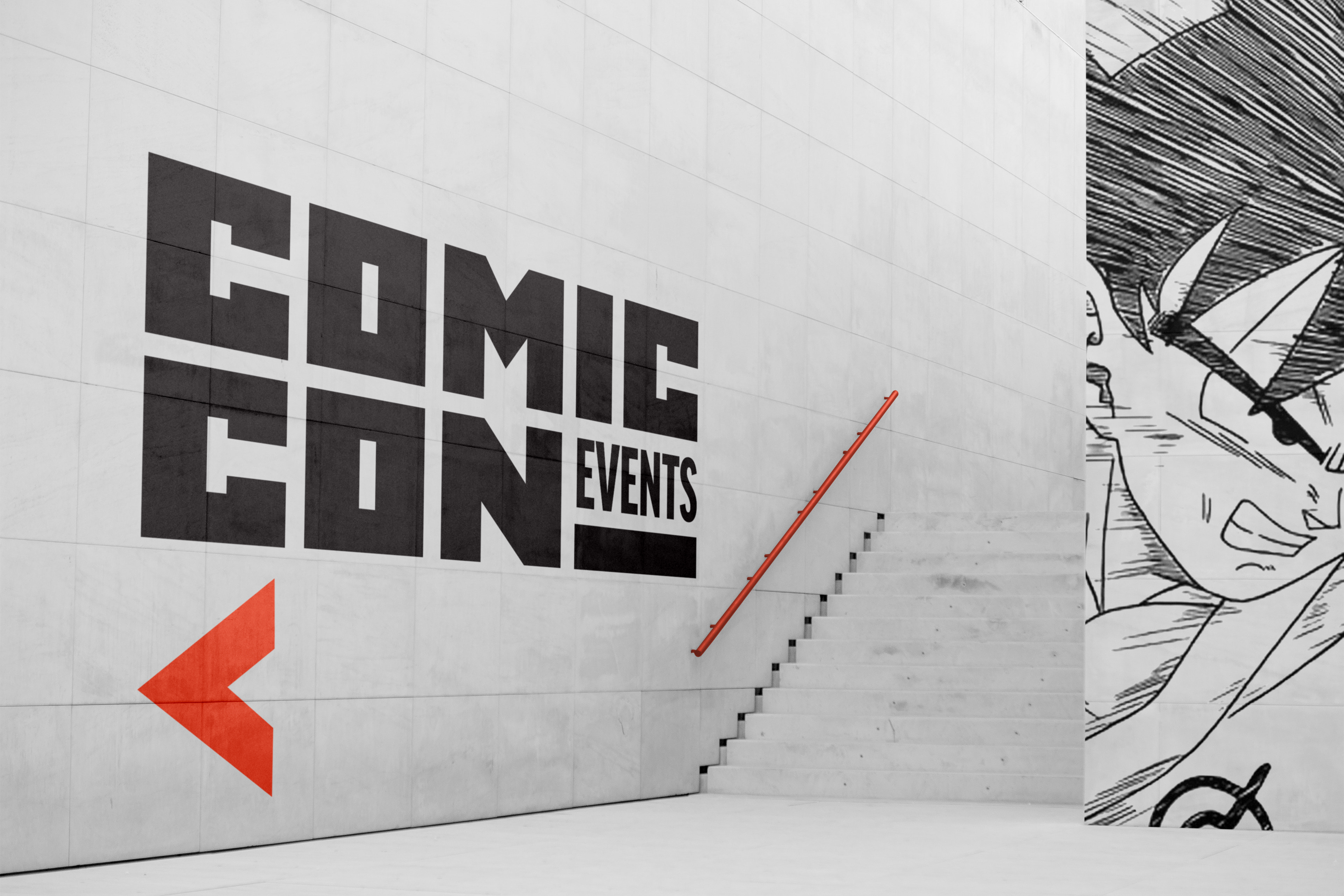
Environmental Graphics
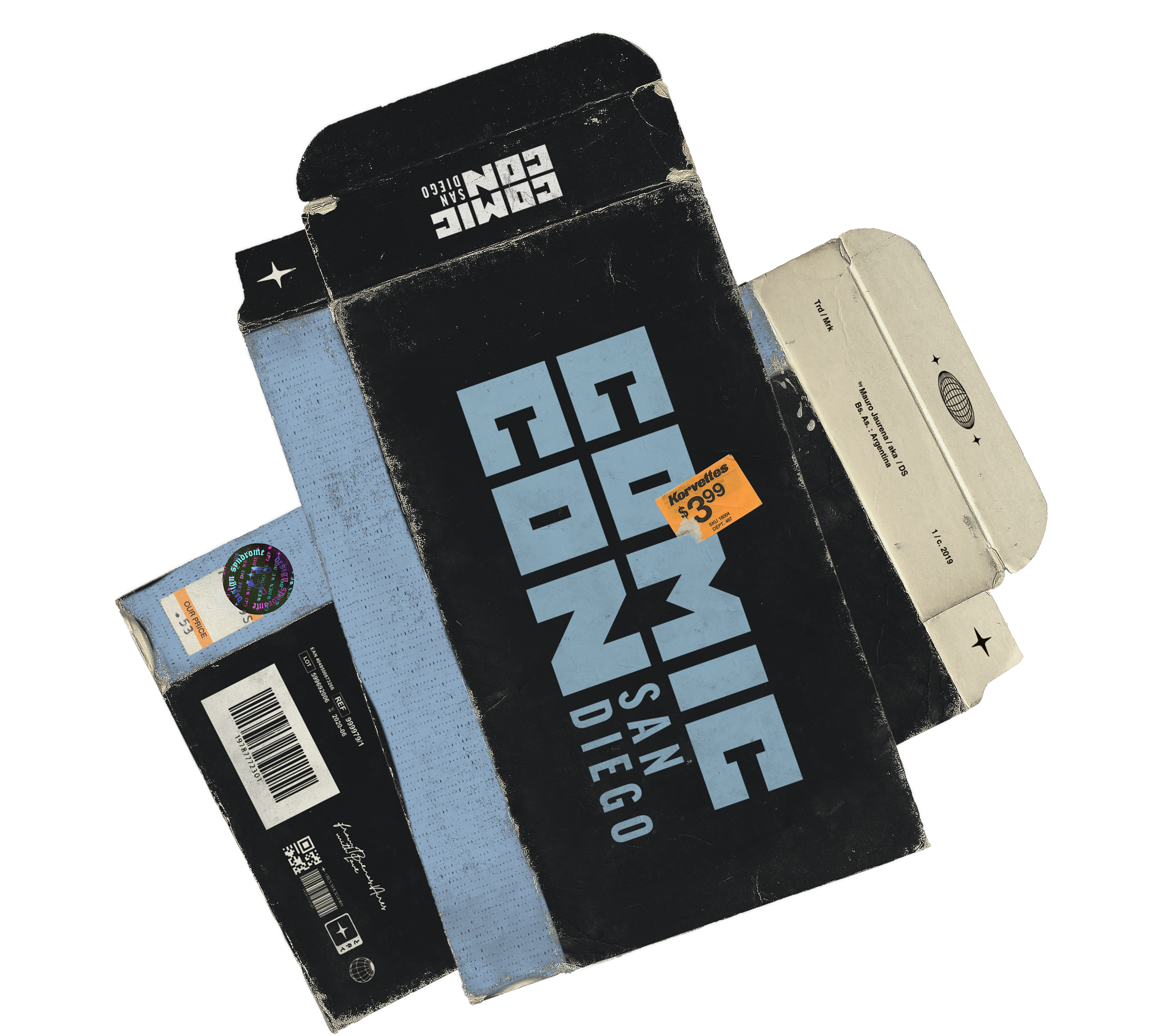



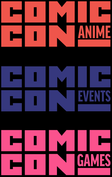
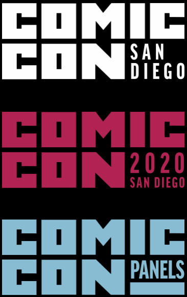
The first visual tackled was the logo. It needed to be bigger and bolder than all the other conventions around the country. And since Comic and Con didn’t have the same length, the leftover space perfectly fits different venues and events within the Comic Con brand.
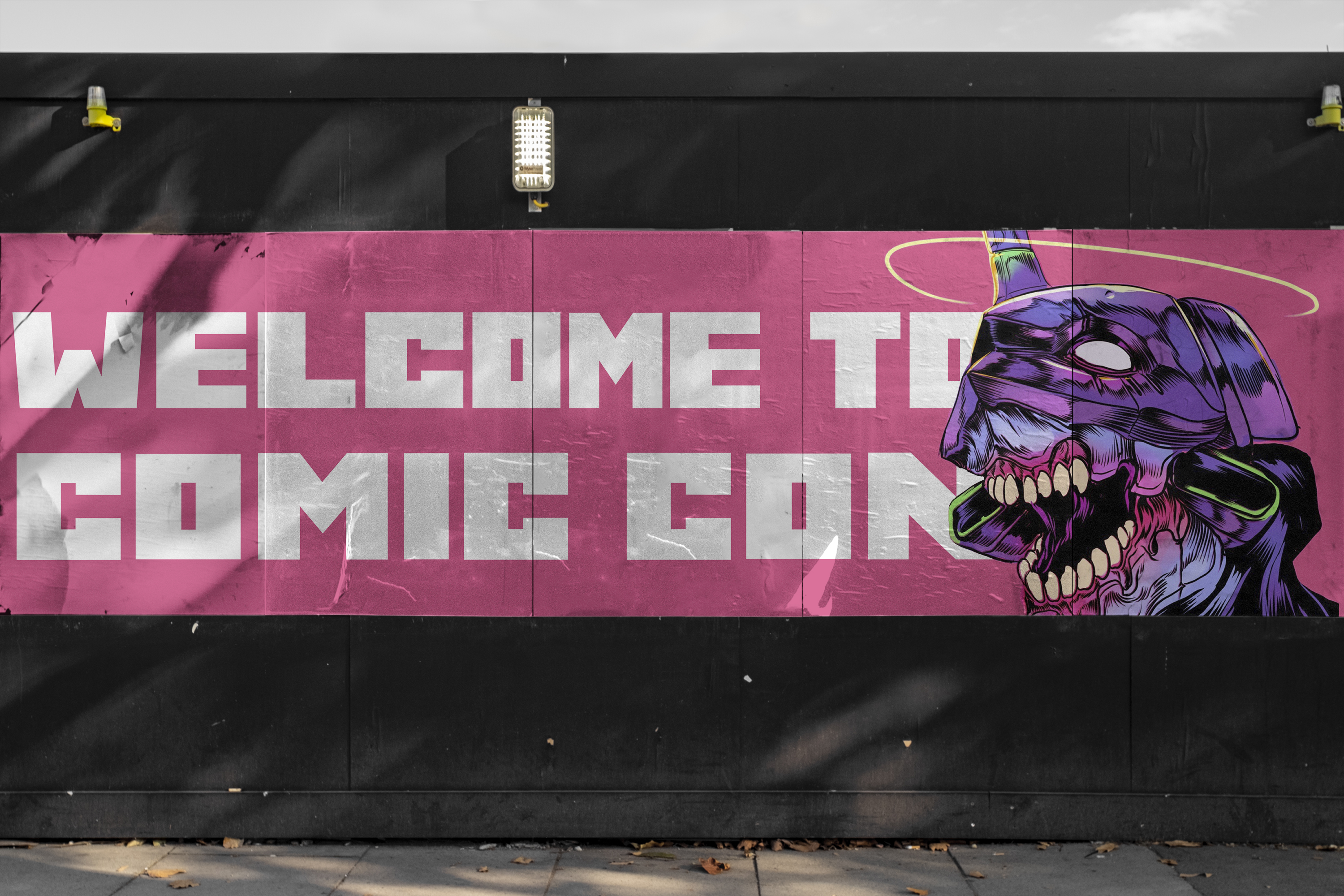
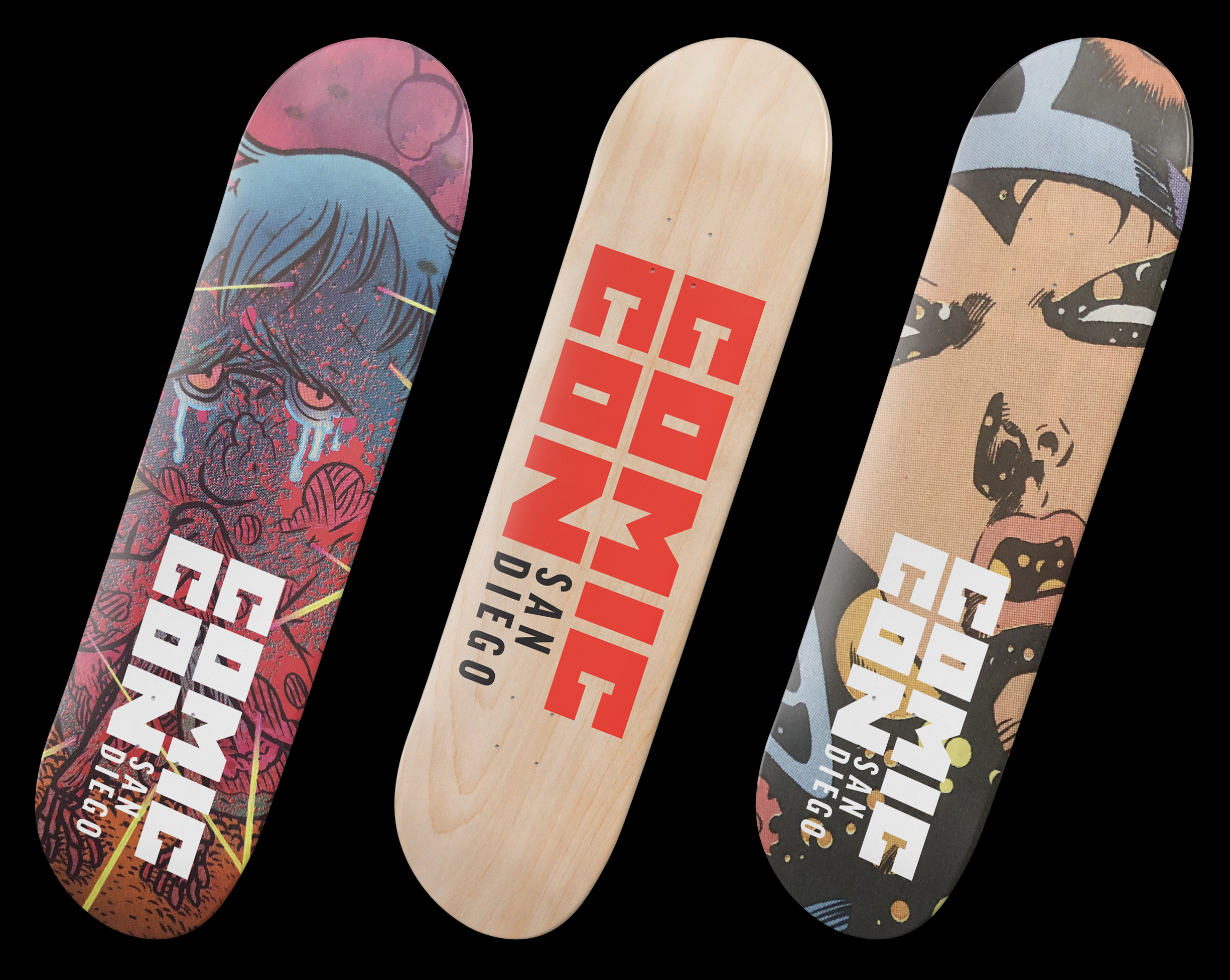
This wild typeface was also developed specifically for Comic Con. It’s called Comic Box because, well, all the letters were made by trying to fit them into a box. The modular logo can be any scale. Small in the corner of collectable posters or HUGE on the side of a building.
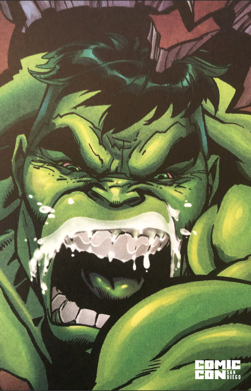
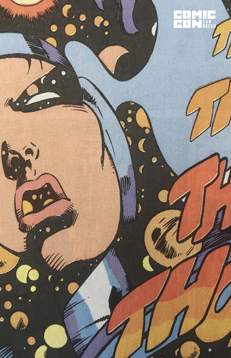

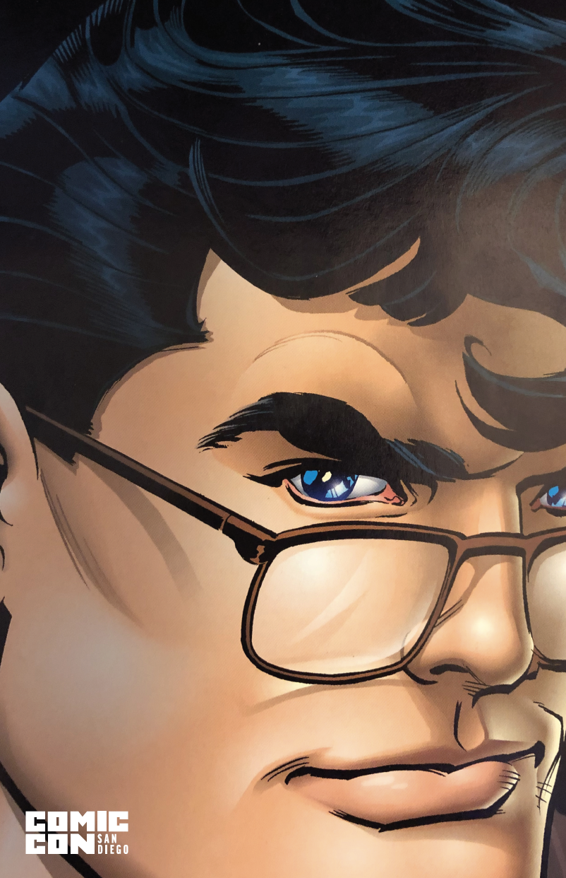

The collectible posters were developed so people could purchase one or the entire series. The logo lockup is kept small in the corner so it doesn’t interfere with the artwork.
Every year, the imagery for Comic Con both inside and outside the convention will focus on old captures of comic books along with new media from the year.
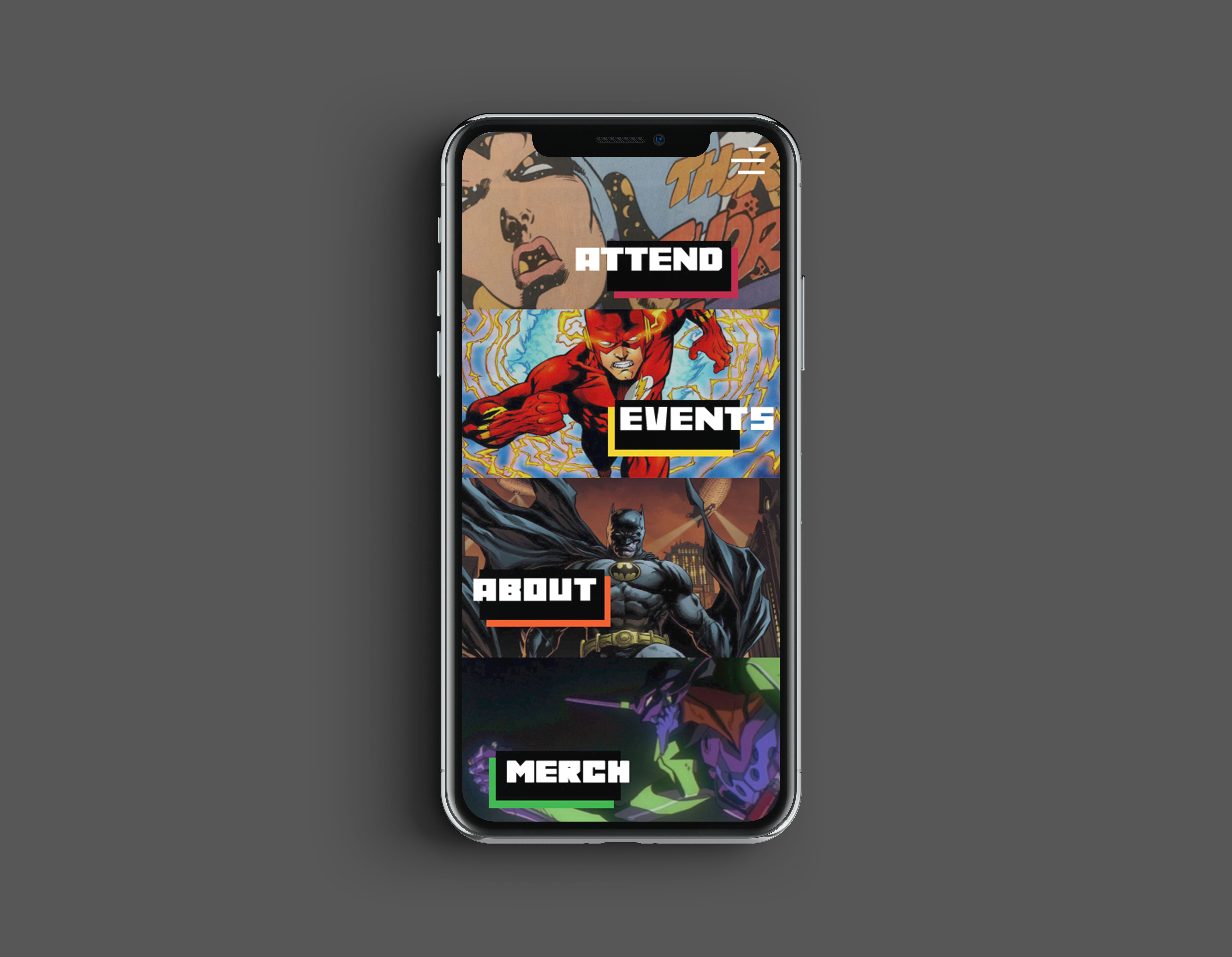
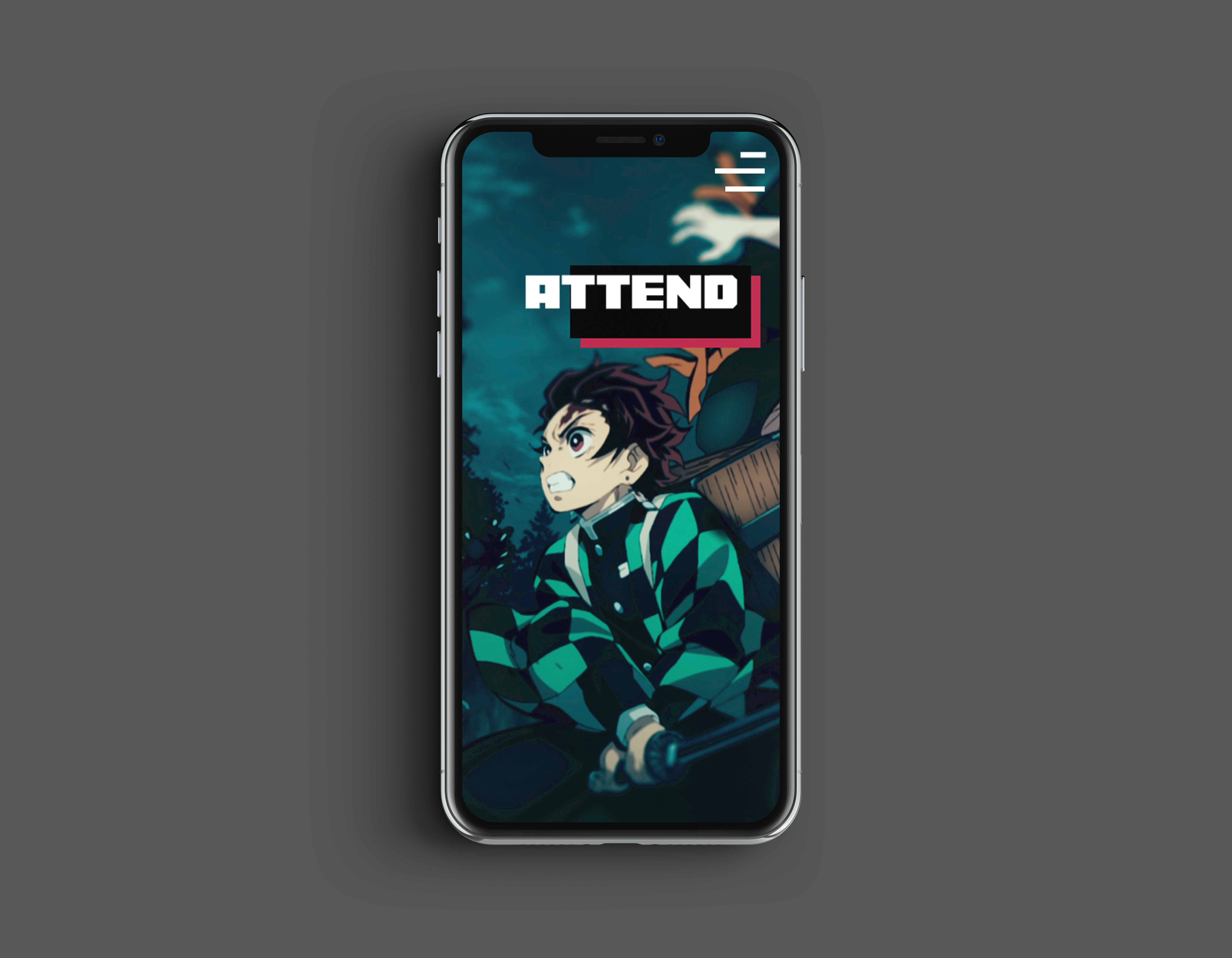
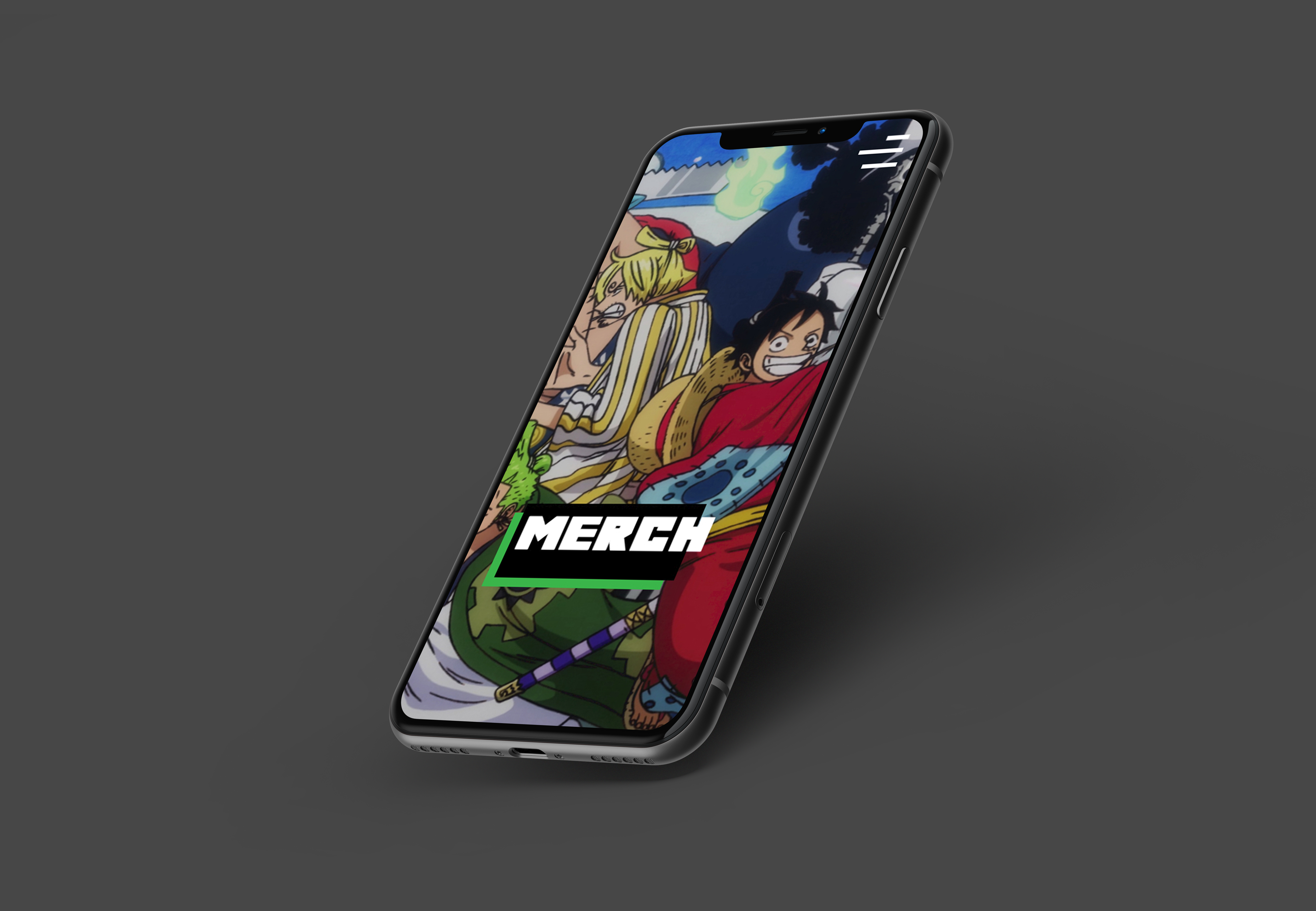
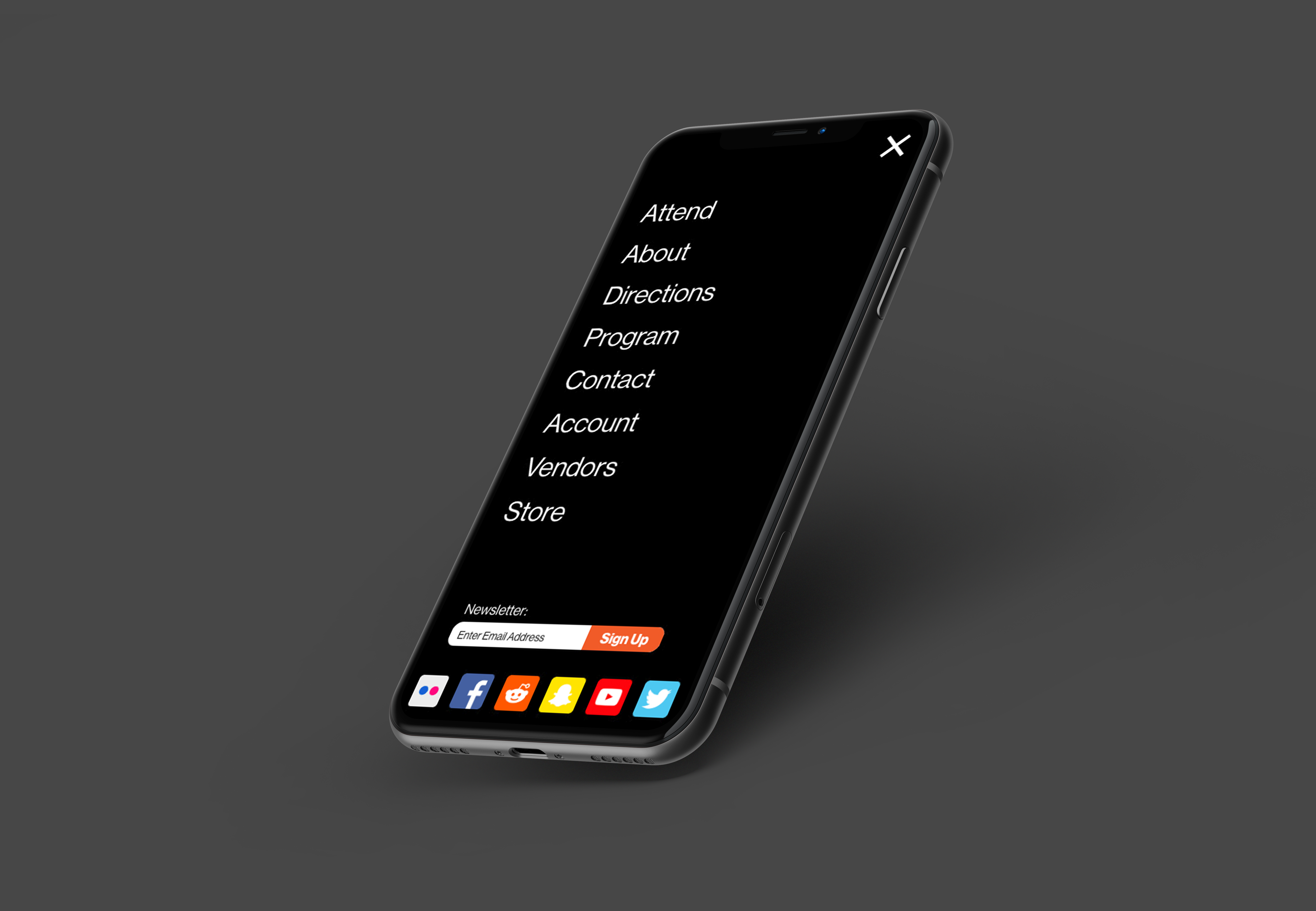
The mobile app is geared towards convention-goers. Walking around a giant building all day, trying to see everything you can, it’s hard to catch all the little details. Making everything, every button, and every bit of type huge on the app means less looking at a phone and more looking up.
In the app, users will find all the events they need, a dedicated merch tab where they can then pick up or ship their items, and an easy-share option to let everyone know what’s going on at the convention.
