Escape From Tarkov
Escape From Tarkov is a hardcore, first-person shooter style game currently in beta phase. Possibly the most difficult and punishing in the genre, the gameplay is completely unforgiving. Tarkov features beautiful, immersive landscapes and maps that contrast with the tough, intimidating gameplay.
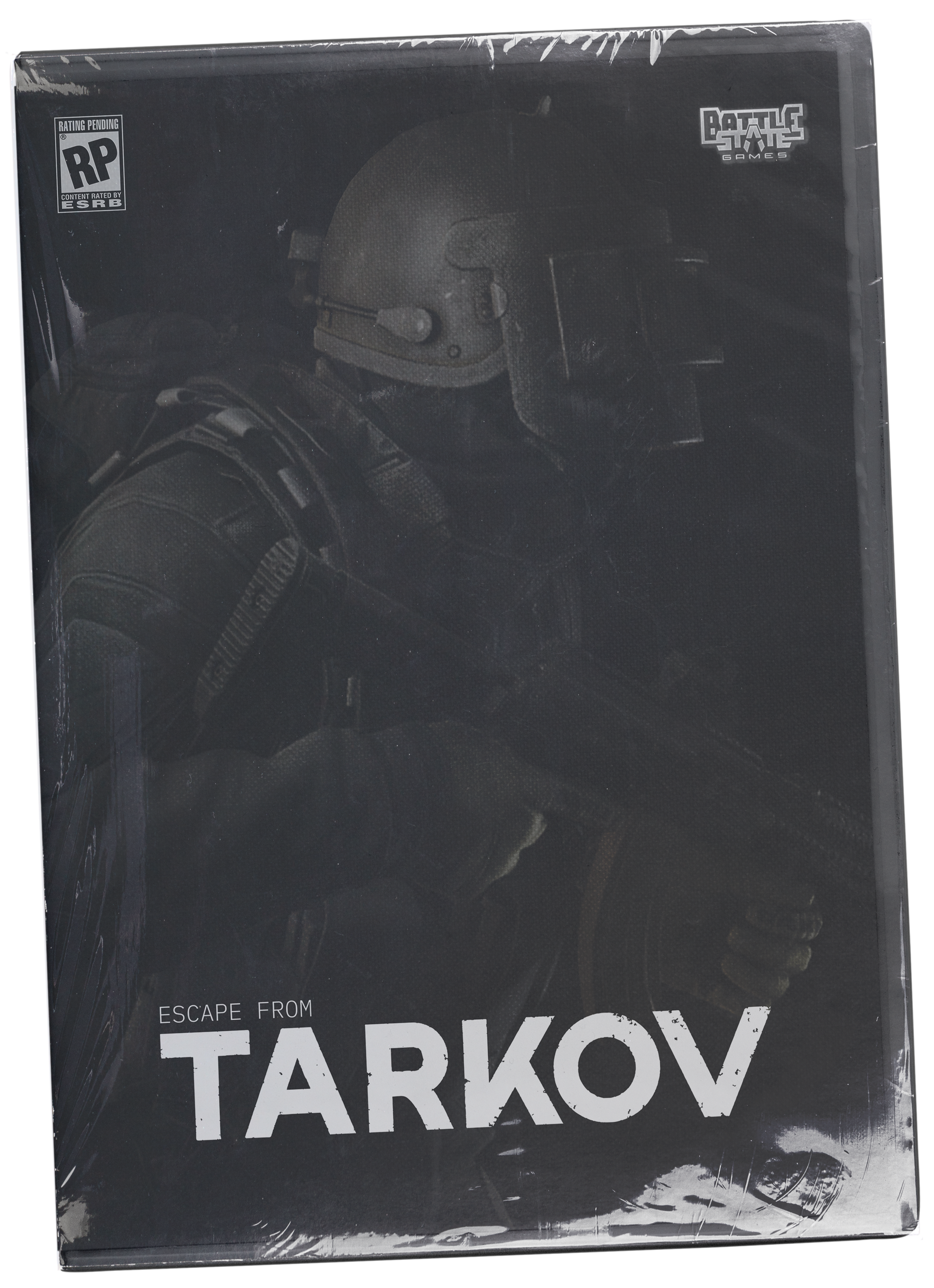
Taking this contrasting idea and applying it to a visual system, the game and surrounding graphics evolve to become one. Using heavy texture overlay, progressive wear, and blur treatments, along with Russian graphic styles, the new visuals of Tarkov stand out from others in the genre.
Mentor for the Project:
Ivhan Escudero, Riot Games
Deliverables:
Logo Redesign
Poster Campaign
UX/UI
Key Art Posters


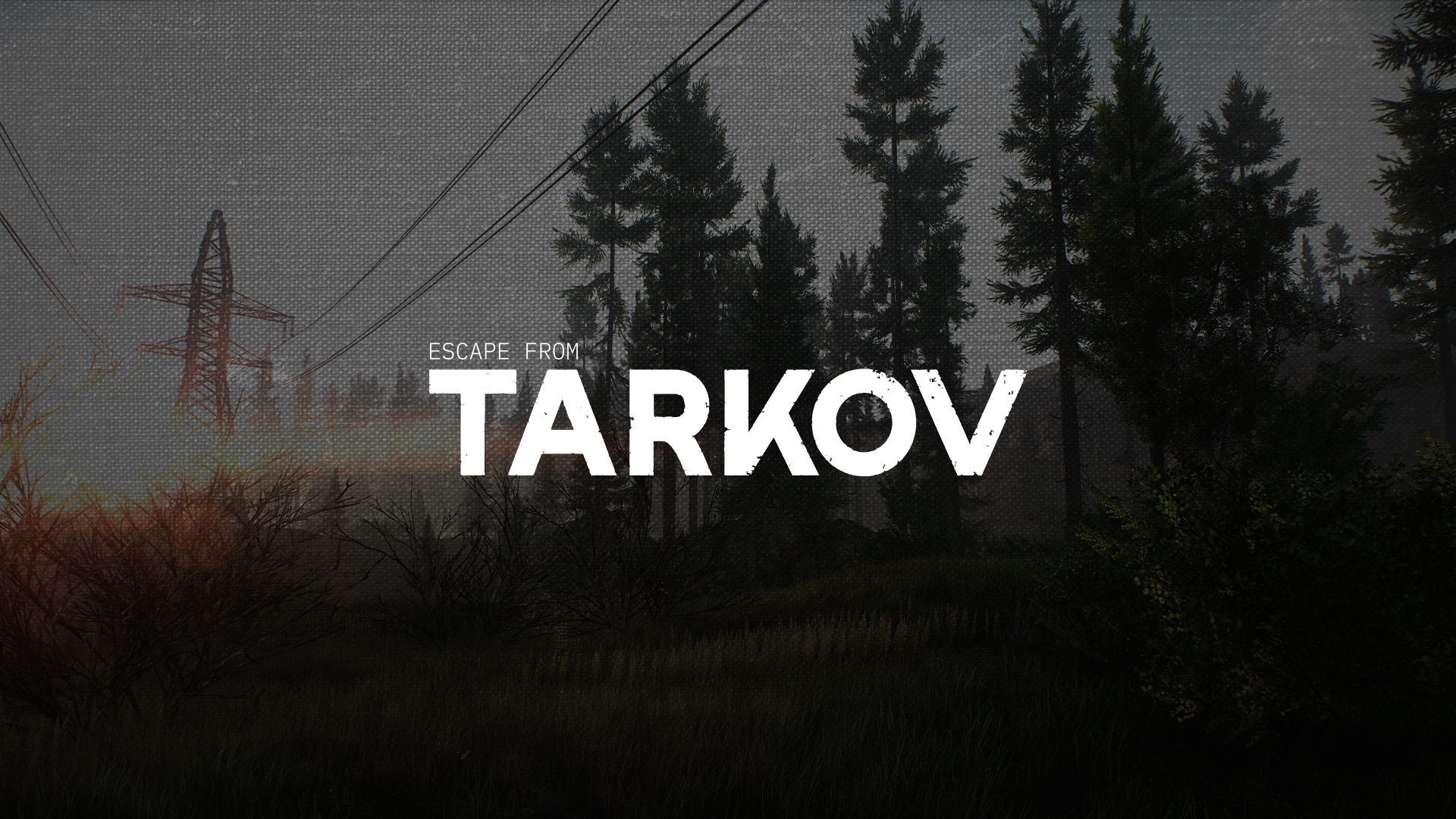
The final logo above utilizes a progressive wear and tear style. Over time in the game and through brand imagery, the logo can fade, decay, etc.
The below logos are iterations and concepts before the final stage. Testing out all the logos in environment and scenery helped influence future visual styles.
The below logos are iterations and concepts before the final stage. Testing out all the logos in environment and scenery helped influence future visual styles.
This animation shows the wear and decay states it can go through. This shows up in imagery and UI elements within the game.


This first key art + poster campaign concept focuses on the two factions within Tarkov. Showcasing the different characteristics of each, players can begin to connect with characters and options before even entering the game.
Both series of posters utilize multiple layers of texture and wear on both the logo mark and the imagery. The intimidating poses combined with the image treatment starts to provide a feeling for the player experience.


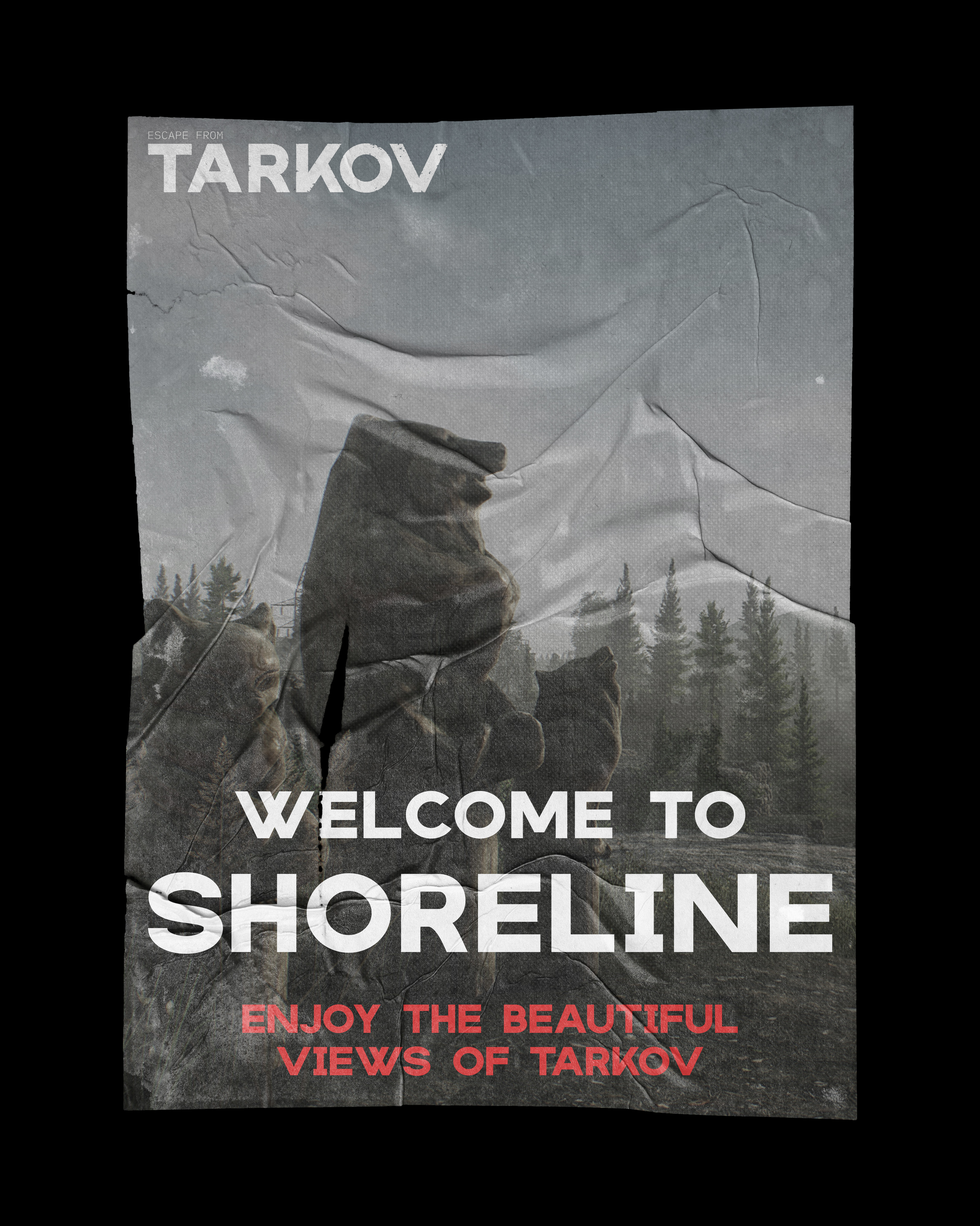
The second key art concept and poster campaign focuses on the landscapes of Tarkov. The goal was to position this series as welcoming, inviting, almost propaganda-like posters.
The landscapes of Tarkov feature beautiful scenery which contrasts pretty harshly to the intense gameplay and action. With this, some players might be drawn to the “Enjoy the beautiful views of Tarkov” series.
The UI design for the Tarkov Launcher / Client was inspired from the progression found in the logo. Keeping the overall style rather simple for visual clarity, the user is guided through the journey with visual clues such as hover states and welcome messaging.
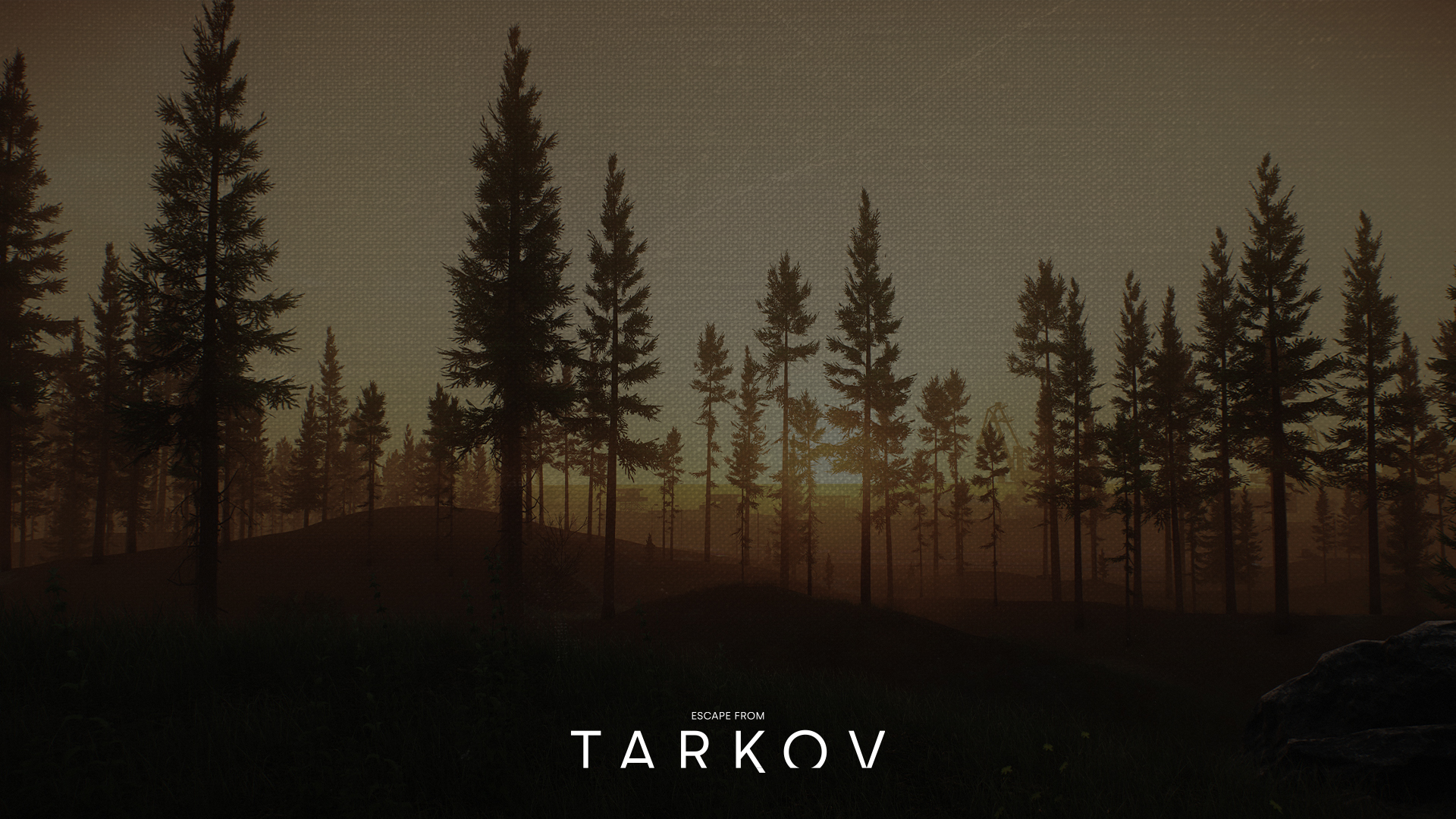
After launching, the loading screen features a decaying logo and unclear backgrounds. As the background comes into focus, the logo is removed.
