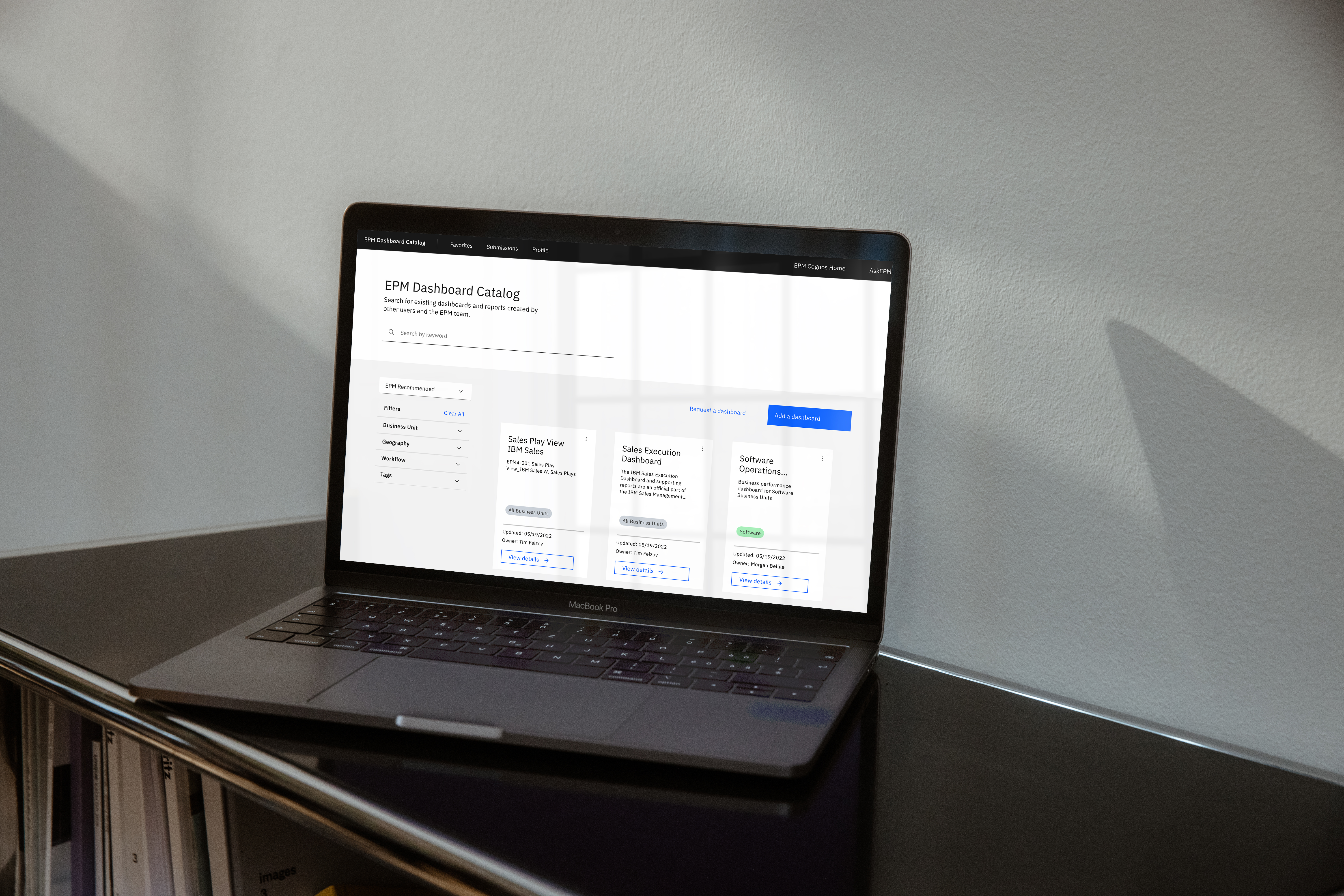
EPM Dashboard Catalog
The EPM Dashboard Catalog is a tool designed both for and with end users of EPM. EPM is IBM’s trusted source of integrated enterprise data. The platform offers dashboards and reports full of data to meet the needs of IBMers. However, finding the dashboards you need to use can be a tough task for new and even existing users. Also, it takes a lot of time and skill to build a dashboard. Many people can’t do this or don’t have the time. They would rather use an existing one.
The EPM Design Team set out with a goal of creating a simple, scalable, intentionally designed solution. The EPM Dashboard Catalog allows users to both find and submit dashboards. With this tool, the EPM onboarding process and journey is simplified even further, giving back time to the users...the overall goal of EPM as a whole.
Designed in Figma using the IBM Carbon Design System
Team:
EPM Design Team @IBM
Role:
UX Designer and Design Researcher

︎
FINAL SCREENS / LIVE PRODUCT


The EPM Dashboard Catalog was designed to be simplistic with the end user journey in mind. When a new user gets access to EPM, they might not know where to go or where to find a dashboard for their work. Instead of having to go through exstensive training or ask around, they can visit the dashboard catalog.
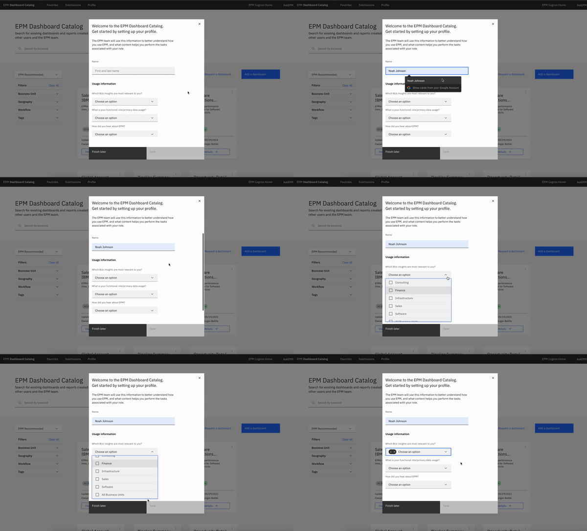
The first time a user opens the catalog, a welcome window will help them get set up and they can make selections to customize their experience. This information also provides the design team with metrics on who is using the platform and how they heard about EPM.

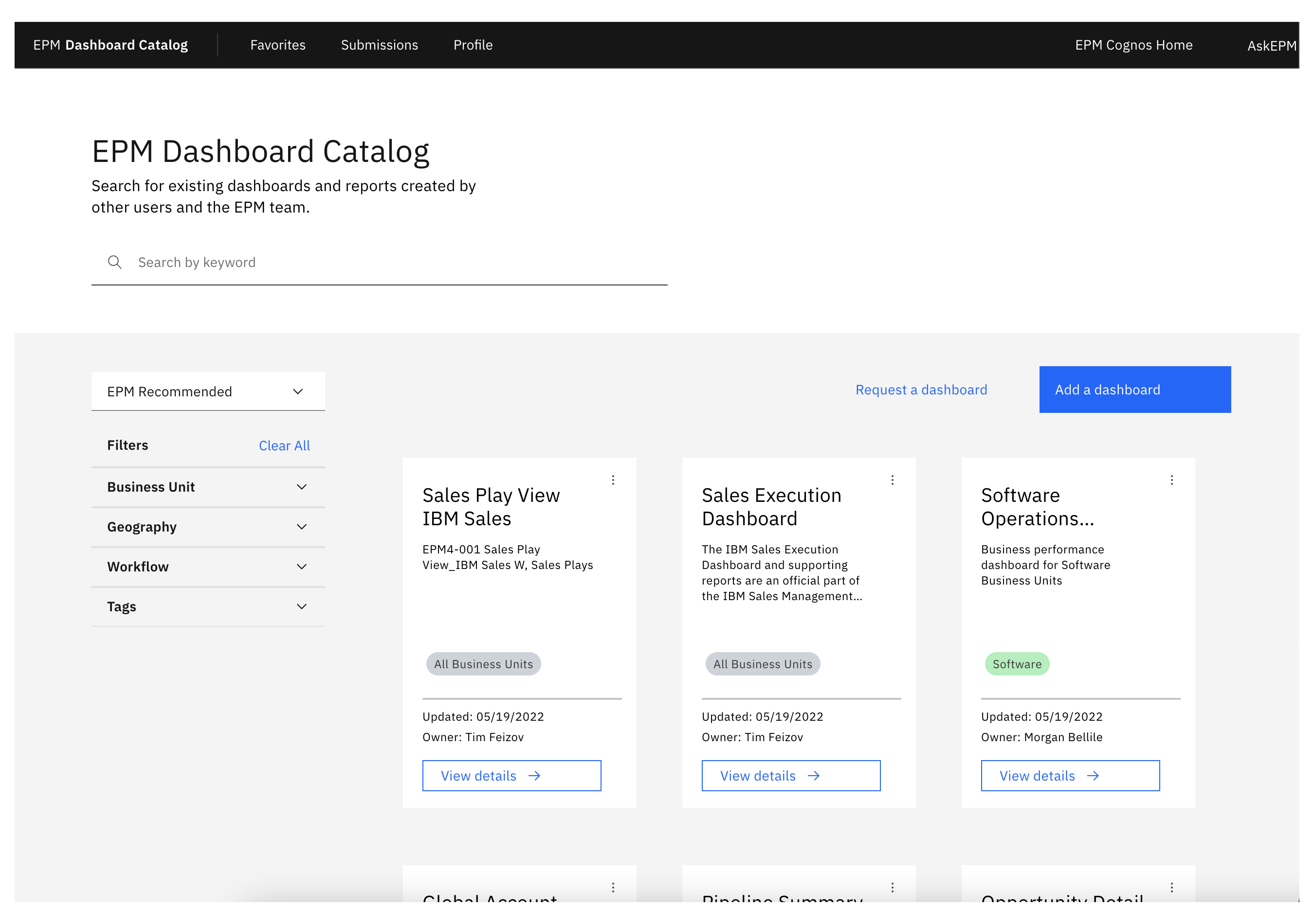
The new EPM user has set up their profile and now it’s time to find a dashboard. The dashboard catalog has two key ways to help users: Search and Filtering. Cascading menus to the left of the dashboard list allow the user to filter by multiple categories. When a user selects one, the list automatically updates. Pills with different colors help users recognize different Business Units on the cards as they search and filter for what they need.
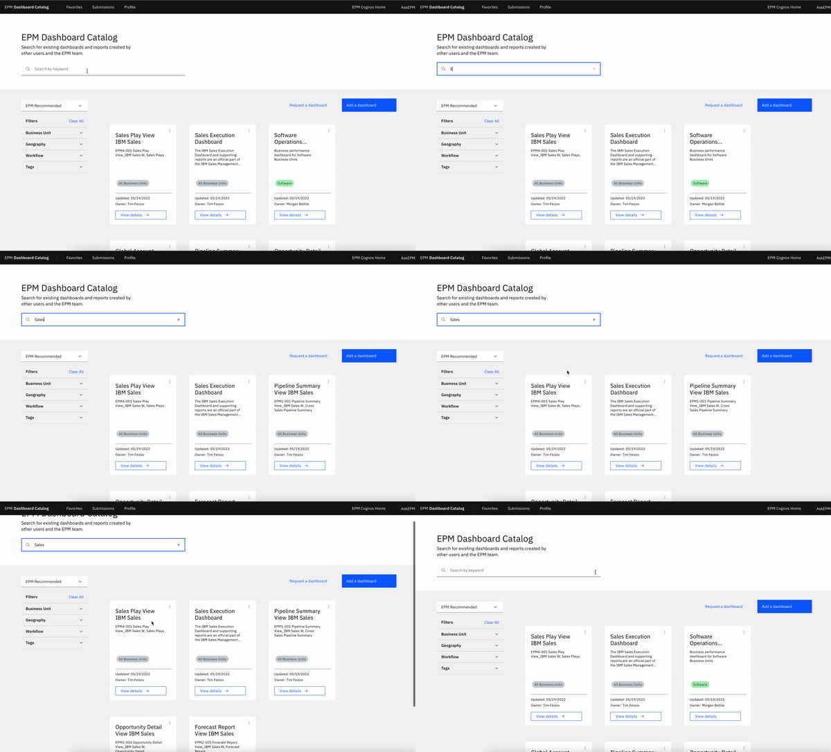
Users can also simply search for keywords or even whole dashboard names using the search bar at the top. Having two key ways to find dashboards keeps this process simple and is less overwhelming to new users. We designed the catalog to automatically sort by EPM Recommended at first so new users know what’s popular. However, users can change the sorting style if they want as well.
When a user finds a dashboard they need, they’ll select “View Details” and a slide in window will appear. Users can view the dashboard name, description, and other details they might need. Just below the dashboard name, users can also choose to “Add to Favorites” to save this dashboard for easy access in the future.
Another tab in the “View Details” slide in window has extra resources for users. The content on dashboards changes frequently, sometimes even daily. Having an easy way to contact the dashboard owner or report an issue is key to keep content current and accessible.
︎
PROCESS / TESTING SCREENS
After multiple rounds of stakeholder interviews, design reviews, and design sprints, we had a prototype for user testing. Alongside the design research lead, we tested multiple user flows with dozens of EPM users.
I was in charge of creating the working prototype for user testing, linking multiple screens, buttons, and options. The goal of the prototype was to allow users to make mistakes or click something that wasn’t intended. Instead of having unclickable options, users could choose anything so we could see their entire thought process and revise designs.
